Melancholy- A state of Inertia
The breakthrough achievements of Helen Adams Keller are a stellar example of how if given the right access to education, no disability can hold you back from achieving the impossible. Her larger-than-life contributions to society have been a guiding light at the end of the tunnel to inspire us all to find the spark inside us.
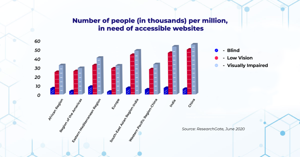
Visual impairment is a vast term and subsumes anyone whose eyesight cannot be corrected to a normal level. The common types of vision impairments fall under subcategories of- Blindness, Low Vision, and Color Blindness. Though vision loss can affect people of all ages, most people gradually develop vision impairment after 50 years of age. As per statistics, India, and China alone account for 49% of the world’s share of blindness and vision impairment, and regrettably this demographic is on the rise. Contributing factors like early and prolonged exposure to screen time, make us all vulnerable to defective vision at some point in our lives; hence web enhancements for the visually impaired or unsighted are a necessitated step.
The following image depicts the number of Blind, Low Vision, and Visually Impaired users from different regions who need accessible websites according to ResearchGate.
Facilitation of Visual Retreat
A Pivotal step in implementing accessibility (for the visually impaired) across digital landscapes begins with the conception of an impaired user making sense of the internet. It guides the backend team to be better equipped and run the assistive tools (refreshable braille displays, screen readers like JAWS, NVDA, and VoiceOver, special keyboards, and speech recognition software) for testing compatibility between the user and content.
The following are the mandatory checks keeping vision disability in mind:
Organized Page Structure and Keyboard Accessibility
People who are blind use screen readers to navigate the web. Screen readers read the text aloud or convert it into Braille using Braille Displays. For the screen reader to work efficiently and for reasons otherwise, it is in the best interest that the webpage provides seamless navigation by defining landmark regions, clarity in content, and structured markup while omitting the unnecessary part. Also, the flexibility to access the content online via enabling keyboard accessibility is a must. Buttons, links, and widgets that require a mouse or a touchpad should be functional by using the tab key as well. The dependency on keyboard usability for shortcuts and commands, in general, has increased for all users.
Accessible Color Palettes and Sufficient Contrast
Red-green color blindness is the most commonly found type of color blindness, followed by yellow-blue and complete color blindness. Though at times, it could go undetected for years or not account for a major disability, it surely alters user web interaction. Color and Contrast go hand in hand. Sometimes, the combination of background and foreground colors makes the content unreadable to colorblind users. To ameliorate the experience for users and avoid refurbishing towards the end, we recommend the use of color contrast checkers that help us to select perceivable color palettes and adhere to WCAG level AA conformance that requires a contrast ratio of 4.5:1 for normal text and 3:1 for large text.
Adjustable Font Size and Text Spacing
The liberty to use magnifying software to scale the text up to 200% and adjust the font size in the browser settings is essential to be digitally inclusive besides making sure the font size and family used are legible for everyone; furthering engaging user experience globally.
The word spacing is also proportional to the level of difficulty the user experiences to read the text in your webspace.
Alt Text and Description for Non-Text Content
This is an accommodating feature where one provides text alternatives for the visual content by mentioning alt text for the images and long descriptions for charts, graphs, and tables. This enables popular accessibility tools such as the screen reader to read out descriptions for images; making the content interactive for the visually impaired.
Using Descriptive link labels also promotes navigation for both sighted and unsighted users besides boosting SEO for the site.
Audio Description
The insertion of audio description during pauses and description of visual information such as a scene explanation, the characters in the scene, changes to the scene, etc by a speaker in between the portions of dialogue by freezing frames.
Offering a detailed description of all visual elements including context, actions, and expressions of characters without which visually impaired users could likely miss out on information.
Color Reliability
Almost universally, people understand that a link is in a blue text that is usually underlined, yet a lot of websites exist where the blue underlined text does not link to anything. Colorblind users should have the conviction that when the color treatment is taken away, the underline will make them aware of a link.
Actionable page elements such as text links and buttons as well as alerts and warnings clarify that these are significant to the user by incorporating more than a simple color change.
Buttons, Images, Links, and other such elements can be enhanced with an icon, shape, positioning, or text. Each page element should have multiple visual cues including the use of icons and relevant labels accompanying alerts and actionable page elements.
This will enable users to recognize primary action cues, such as size, placement, boldness, and icons.
Tailored Tool to check Color Contrast
With the wide array of free as well as customized assistive tools for the visually impaired, we are glad to garner our accumulated skillset to create our very own bespoke assistive tool- Color Contrast Checker by Pivotal Accessibility.
The Color Contrast Checker gives an extra edge by pointing out color suggestions and recommendations and rather than disrupting the entire color scheme offers specific background and foreground color amendments; facilitating to perceive web as it is meant to be.
Our team is driven to perform top-of-the-line testing and offer remediation, creating accessible digital spaces. We follow the train-the-trainer model at our workplace that promotes educating everyone involved in the process to develop a deeper understanding of the why and how rather than just working on the cosmetic layer.
With our tool in progression, we are glad to be able to combine our work with passion to create something for the larger good besides ticking boxes in compliance with the accessibility guidelines.
Unfurl the new age of accessibility, book an appointment with us today.