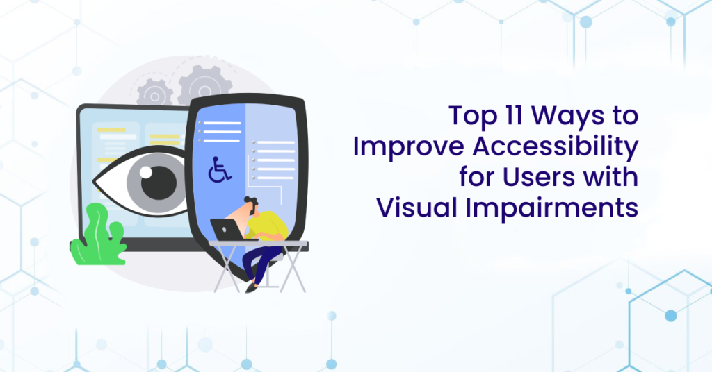
Web accessibility, in simple terms, is ensuring that people with disabilities can perceive, understand, navigate, and contribute to the web. However, many web experiences are inherently visual, leaving users with visual disabilities facing significant barriers. Some websites and apps are virtually unusable for those with visual impairments. For instance, it’s common to come across websites with text blending into the background, hindering colorblind users.
Inaccessibility means exclusion. Disabled users miss out on valuable information, and the website owners miss potential customers and the chance to share their message.
Millions Affected by Visual Impairments
According to the National Library of Medicine, there are 253 million people with visual impairment worldwide. Of these, 36 million were blind and a further 217 million had moderate to severe visual impairment. Visual impairments encompass a wide range of issues, including color blindness, low vision, and blindness. Color blindness affects around 8 percent of men and 0.5 percent of women globally, making it a considerable concern for website owners.
How to Ensure Accessibility for Vision Users
To ensure that websites are accessible to everyone, developers and designers should follow these practices:
Include Descriptive Titles for Every Page
Page titles should describe the topic or purpose of the page. This title is crucial because screen readers announce it when users first load a page. This practice saves visually impaired users time by immediately providing an overview of the content.
Structure Content with Semantic Elements
Use semantic elements like
Ensure Sufficient Contrast
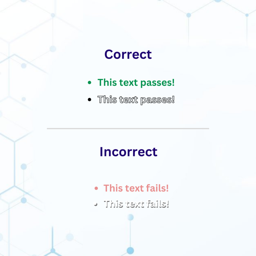
Sufficient contrast between text and background colors is vital for readability. Use tools like our Color Contrast Checker to evaluate color contrast ratios. According to WCAG level AA, normal text should have a contrast ratio of at least 4.5:1, while large text (14 points and bold or larger, or 18 points or larger) requires a 3:1 ratio.
Limit and Prioritize Colors
The more colors you introduce into your design, the more challenging it becomes for users, especially those with color blindness, to identify primary actions and links. Use color blindness simulators to see how color choices affect different users.
Design for Different Viewport Sizes
Users with visual impairments may zoom in on your site or use a screen magnifier. Responsive design ensures your site remains usable at different zoom levels and on different devices.
Don’t Rely Solely on Color
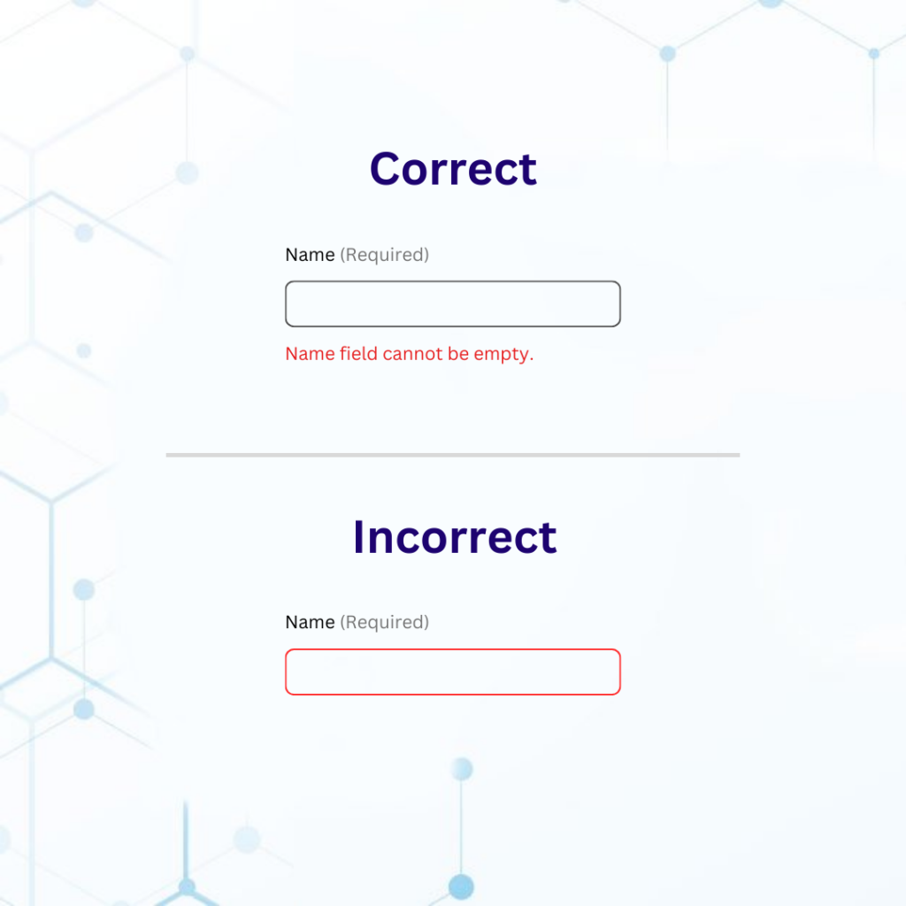
Consider that not all users can perceive color changes effectively. For alerts, warnings, and actionable elements, utilize underlines, icons, shapes, positioning, and color changes. These multiple cues ensure that users can understand and interact with your content.
Grant Keyboard Accessibility
Keyboard shortcuts provide a more efficient navigation method for users, especially those who rely on screen readers. Since a mouse requires hand-eye coordination, keyboard commands offer a practical alternative. Users who are blind find keyboard shortcuts particularly useful.
Use Descriptive Links and Buttons
“Click here” is a vague and unhelpful link label. Descriptive and explicit link labels, such as “Read the latest news” or “Download the accessibility guide,” provide users, including those with visual impairments, with context-independent information. Moreover, use straightforward text for buttons and employ ARIA labels to give precise information about their functionality.
Create Accessible Forms:
Labels should be associated with form controls so screen readers can understand their purpose. Placeholder text should not be used as a substitute for labels.
Avoid CAPTCHAs
CAPTCHA (Completely Automated Public Turing test to tell Computers and Humans Apart) tests are often inaccessible to visually impaired users. If necessary, provide an alternative means like Multi-Factor Authentication or Biometric Security for increased accessibility.
Provide Alt Text for Non-Text Content
Alt text is vital for screen reader users, as it describes images and graphics that vision users cannot see. Keep descriptions for video and audio concise and to the point. A good practice is to convey essential information with as few words as possible to prevent screen readers from skipping content.
Conclusion
Ensuring accessibility for individuals with visual impairments is not just a responsibility but an opportunity to embrace diversity and make a positive impact. Moreover, it also helps businesses capture a wider user base and improve their brand’s image.
Explore our full range of services and take the first step toward a more inclusive online presence. Our DHS and IAAP Certified accessibility experts can help you start on your accessibility journey. Contact us today to learn more about all the accessibility services we offer and how we can help you achieve your accessibility goals.